Double Diamond design process highlighting key project phases.


Nov 2023 - Sep 2024 (still supporting the team)
Client project: end-to-end UX/UI and brand identity redesign
busk.town is a platform that empowers musicians, singers, and bands by providing tools for accurate chord viewing and enhanced live performance management. I was tasked with redesigning the platform’s UX/UI, developing new features, and creating a cohesive brand identity, all backed by user research.
Visit the live site:
busk.town

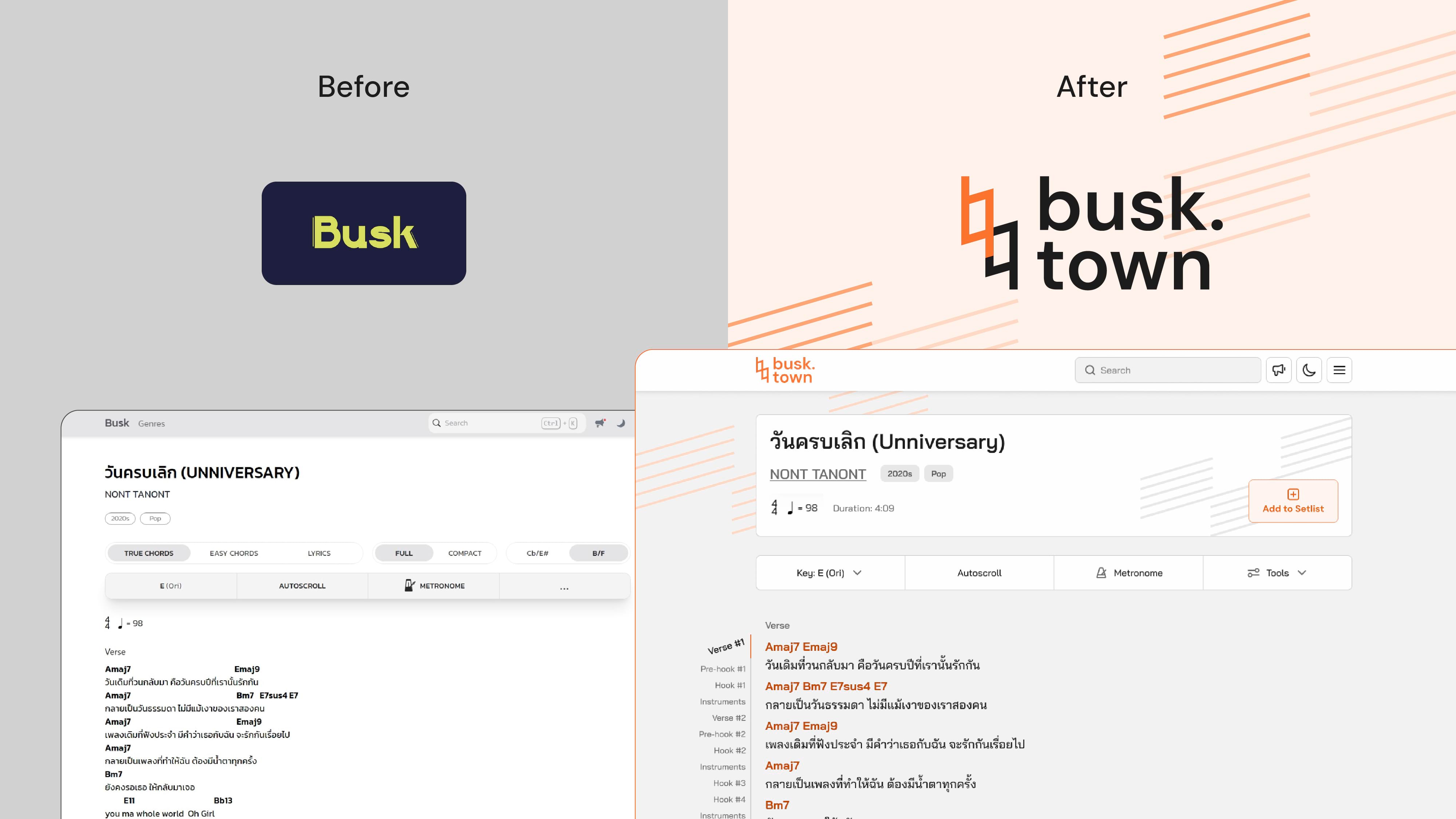
After developing Chordette as a self-initiated concept, I was commissioned to scale that vision through busk.town.
busk.town was created by a group of passionate musicians who also took on development roles. However, it was initially built without the involvement of a designer, which resulted in some usability challenges and a lack of cohesive branding.
To prepare busk.town for growth by refining its brand identity to align with the client's new vision. This included enhancing usability, and creating a seamless experience for new features, all while maintaining consistency across the updated interfaces.
I was tasked with redesigning the platform’s UX/UI, developing new features, and creating a cohesive brand identity, all backed by user research.
As the first and sole designer on the project, I was responsible for all design aspects from initial research through implementation.

25%
increase
in registered users.
30%
growth
in monthly active users.
35%
increase
in navigation to a previously underused feature.
29.7%
reduction in task completion time
based on before-and-after user testing of the most critical task.
91%
success rate
for a new feature introduced in the final usability testing.
Double Diamond design process highlighting key project phases.
I began by thoroughly evaluating the original design through different scenarios to identify issues. I presented these findings to the client to align our understanding of the problems. These insights formed assumptions and later shaped my user testing tasks to verify if others faced similar friction points.

I conducted research with participants across different groups; singers and musicians, as well as new and current users of the product. My approach combined semi-structured interviews to understand behaviours, usability testing to identify pain points, and A/B testing of moodboards for brand direction.
After combining insights from both my initial evaluation and these research sessions, I organised all findings using affinity diagramming and ranked key issues with the Usability Severity Rating Scale. This helped me prioritise which features needed improvement and identify gaps where new features were required.

Participant demographics and affinity diagram categorising key findings.

Issue prioritisation matrix using Usability Severity Rating Scale to determine development focus.

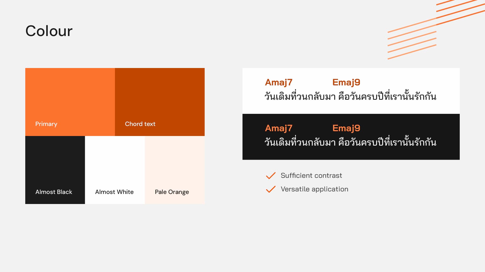
Typography and colour choices directly impact how musicians read chords on stage, often in challenging lighting conditions. These elements can make the difference between a smooth performance and a frustrating experience. Strong visual foundations weren't just branding elements, but they were essential to improving busk.town's core functionality.
I approached typography and colour selection to serve both brand expression and digital platform needs simultaneously, ensuring they work effectively across all touchpoints.
The previous Thai typeface used a loopless style, which despite its modern appearance, compromised readability in text-heavy platforms like busk.town. I chose a modern loop typeface that balances contemporary aesthetics with improved legibility.

For the colour palette, I selected orange to align with the vibrant brand personality.
However, the selected primary orange, while effectively conveying this bold identity, has accessibility challenges. So, in further iterations, I developed multiple shades and variations of orange, especially for chord text, to ensure strong contrast ratios and meet accessibility standards throughout the key content.

With a solid base of active users, I knew busk.town needed evolution, not revolution. Rather than a complete redesign, I preserved familiar elements to match users' mental models while introducing subtle improvements to the flow. Through wireframing, prototyping, and testing, I developed solutions that enhanced usability without disrupting user familiarity.

Wireframe sketches of the dashboard and new features.
Research insights directly informed my interface improvements. For example, I added a 'Create New Setlist' option directly within the 'Add to Setlist' flow, eliminating unnecessary navigation steps.

Redesigning a platform built by musicians, I ensured critical details weren't overlooked. Small but impactful additions, like queue duration displays to help with set timing, came from real performer insights.

I conducted usability testing with a high-fidelity Figma prototype to validate design decisions in real-world tasks. The results revealed both successes and challenges: while some new features achieved a 91% success rate, others struggled with only 50% completion. Still, it was impressive that users were still able to complete the most critical task 29.7% faster compared to the original design.

Screenshot from a usability testing session.
These insights were invaluable for identifying necessary refinements before finalising the interface, ensuring that the redesign actually hit the right note.

Successful designs validated.

An example of design that need further refinement.
I utilised Figma's Variables feature to create a comprehensive design system handling multiple device sizes, colour modes, and language options. This systematic approach made it efficient to implement changes consistently across all designs.

Figma variables used for the design system.

Dark mode tablet and light mode mobile song page examples.
I designed a responsive landing page that clearly communicates busk.town's unique features while highlighting the benefits of both free and paid plans. The page serves as both an introduction to new users and a conversion tool, presenting the platform's value proposition through visually engaging, musician-focused content across all devices.

Responsive landing page hero section across devices.

Landing page lower sections.
My biggest challenge on this project wasn't figuring out what needed fixing. The client wanted a redesign, and my research pointed to clear UX improvements. It was deciding how much visual change was too much. I found myself constantly asking: "Am I being creative enough?" quickly followed by "But am I changing too much?"
After stepping back and thinking it through, I realised I didn't need to overhaul everything completely. It was more about strategically adding new design elements only where they reinforced better experiences. I also found out where to add fun brand visuals and where I shouldn't. This mindset helped me create a design that felt fresh and on-brand without throwing users into unfamiliar territory.
I was glad that Figma released its variables feature before this project began. I had fun exploring design tokens, primitives, and semantic variables. It was a lot of self-learning as I went, but it's definitely knowledge I'll carry forward to other projects.
The great feedback was that the devs really appreciated how I organised the tokens and Figma files. However, I wish I'd been more thorough with annotations. I only annotated some pages since we had regular meetings and the team already knew their product inside out. I recognise that strong handoff skills would be super valuable for projects with external developers. So, this is definitely something I'll explore more in the next projects.

Smon quickly learned about every details in the existing application and identified key issues ... She was very easy to work with. She neatly keeps all her deliverables in a single file and consistently shows progress every week. She is able to incorporate new feedback into her design and handle abrupt priority changes during the project.